Saturday, 11 April 2015

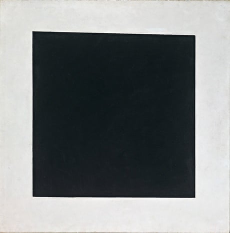
Black is like the silence of the body after death, the close of life." painted by Wassily Kandinsky in 1991


This painting to me gives off a sense of an indie type of music; the reason being is because of the colour scheme. indie artist album covers always included light colours such as cream, which in the painting is the background colour. and other colours such a blue, yellow and green. each colour is a light shade, making them suttle; something that is sometimes used within indie music videos and album covers. looking at the painting, from my own judgement, I see a deformed guitar within the painting taking full shape of a normal guitar as if its in the process of being made; this also links into indie music because they also involve guitars in their acoustics set. Paul uses a variety of colours, but used a sort of cream/green/blue background that blends together well making the different shapes within the painting stand out clear to the viewer but also complementing the background colour. something that is very hard to create, but beautifully done by the blending of different shades of colours within this portrait. Using light shades of the selected colours really made the painting more intriguing and interesting to look at because the colours make you feel happy rather than confused about the object trying to be represented. what makes this painting unique and different is how he does not try to portrays or make a clear visual of an object that you normally see within a variety of different artworks and paintings, but the work still looks like a master piece because Paul used colour to be his painting and used different shapes to add onto the beautiful mix of colours.


This pieces represents EDM (electric dance music) a broad range of percussive electronic music genres produced primarily for dance-based entertainment environment such as nightclubs, raves and festivals. the explosive artwork and colours represents the emotions felt when listening to such music as EDM. also with EDM music, the majority of songs include a base drop, which is represented through the painting with the light colours on the edges of the piece, showing tranquillity and the middle of the pictures shows the thrilling main body of the song for example at the start of where are u now, it articulates a sense of peacefulness whereas once it reaches the base drop, an explosion of sound and almost even colour is presented, just as in the painting. looking at the piece, visually all I see is a explosion/ chaotic scene. as if something bad has happened but then it turns into something beautiful. although there's no visible object I can see, I still manage to be able to see a scene and a story happening through the artwork itself.  The colours that Paul uses within this painting is what gives the painting its loud and dangerous, but fun effect on the viewer cause the colours are bright and very noticeable while the background is a settling colour that is not as bright, but more complementary to the explosive colours.


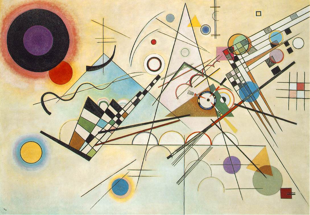
 judging from this piece of art work by Wassily Kandinsky; i get the sense of a jazz themed oil painting. for example the colours used within the painting represent the effects and emotions you would feel, when listening to the music genre; they expresses the sense and energy of jazz, expanding your mind and soothing your soul, as what jazz music does for people. Also another reason to why the oil painting represents jazz through my opinion,is because within the painting contains musical objects such as drums, piano and other instruements that are the basic intruments used when making such music as jazz, and the different symbols around the figures contained within the piece coyld be representing the different emotions and dances created by the mood and rhytm of the music created through jazz.


Thursday, 26 March 2015

chair ideas

These are a few examples of my chair designs; trying to create a variety of different chairs while working with plain A4 paper sheets. A few of the designs were inspired by some of the mood Baard of variety of unique chairs already made and usable. What I did to make the designs of the chairs was watch a few tutorials from youtube. Which showed me examples of origami chair designs to create and also giving me the step by step guide on making the designs; but after the first outcome of the design I created, I decided to come up with my own unique designs as following the tutorials lead to me having the same outcomes as my classmates as they followed the same idea of watching tutorials on making the origami chair designs and landing on the same videos and tutorials as the rest of the class. This lead to a load of chair designs all looking the same, which was boring. A few of my designs were made by mistake/ improved from mistakes I made while trying to create a few original designs; so I changed around the mistakes to then be able to make a chair, improving the designs rather than starting again from scratch. I made a lot of mistakes because coming up with my own designs was a bit difficult, but the outcome of the designs were better than expected.
What I also like about my designs is how each individual outcome is very different and how each design has its own element that made the chairs  have its their own unique designs that interest different people. If I was to create the designs again, I would not change much about any of the designs. Although I would make more varieties of the designs, and also experiment around with the designs, trying to merge some of the designs together to make a completely different chair that has a mixture of qualities from two chairs.

In class we made a macette cardboard cut-out of a chair designed by the artist “Frank Genry”. We were all given the same pieces to cut out, so that everyone had a part in make the chair. Eventually after everyone had finished cutting out their individual pieces, we started to place the chair together. Once glued together, the chair started to form a miniature sized chair version of Franks originally designed chair, capable to be used on display but not to be used to sit on as it’s not strong enough to hold someone’s weight. The materials we used was a scalpel and cutting mat along with cardboard macette. A few others used scissors as it was easier for them to work with and use; but I preferred the scalpel as it was very effective and easy to use for me since I’ve had experience with the equipment enough to handle it. The outcome of creating the chair helped me have more experience with creating a chair design while using cardboard macette, so it was very useful towards my project as our aim is to create a chair. Although working with a cupboard maccette can be easy, but also hard to work with depending on what you are trying to make. For example, working with cupboard could make your outcome quite scruffier, shabby and untidy. Which is not always a great look on your work depending on if you wanted the design messy; but during the process of creating the model chair, since everyone was working on individual pieces that we were going to place together later on. The outcome of the chair was not all equally the same, as some parts were too short, too wide and not perfectly cut to how everyone else had theirs. So there was a huge difference in the effort put into the cut-outs to be neat so the outcome would look better. Overall the outcome was to standard as you could clearly see the chair forum as well as it being able to stand up without a problem. So overall the outcomes was as expected, but could have had improvements.

Thursday, 26 February 2015

ART NOUVEAU


Art nouveau was firstly showed in Paris, and then later in London. The response of the public about the art style was a mixture of two responses, some loved the artwork because of its distinct looks. Such as curvy lines and harsh lines. While others loathed the style.
The style itself includes elongated, curvy lines that are more natural rather than the geometric, lines/shapes that the style art deco uses within the art work. Stylised flowers, leaves, roots, buds and seedpods. The female form in a pre-Raphaelite pose with long flowing hair along with the secondary having exotic woods, and silver and semi- precious stones.

The style was influenced by the arts and crafts movement. Art nouveau shared the same belief in quality goods and fine craftsmanship but was happy with mass production. Due to mass production, many art nouveau items are not valuable although still highly desirable. However, if the pieces is by a known designer, the price soars.
Art nouuveau style is based on organic colours and shapes. The style is mostly inspired by natural and nature itself. Using colours that come from nature and wild life. For example light shades of green and brown within the colour scheme.


VICTOR HORTA 

This work is of Victor Horta. An art nouveau architecture and designer. He designed the four major town houses ‘ hotel tassle, hotel van Eetvelder and maison located in brussels. He’s designs have lead other artists to be inspired within Europe because of his furniture designs and the art form.

What I like about his architecture designs is the way he uses the whiplash curves to forum around objects within his designs, and how they start to lead you around the architecture so you don’t only focus on certain sections and parts of the design, but your lead around it. Also, another intriguing interests for me is the colour schemer he uses as. Using a variety of different shades of certain colours that link within the art style of art nouveau. So using natural and nature colours, but he sometimes make a change so that the designs become more fascinating and attention-grabbing to the viewer or client.
 

Thursday, 29 January 2015

BANKSY

Banksy is a British-based graffiti artist, political activist, film director and finally, a painter; although his identity has remained a mystery, even after over 20 years of being involved within the graffiti scene. He has become the most notorious street artists in the world because of his political and bold street art that always portrays a visual messages. His also developed an entire art subculture devoted to his works. He has worked with many different styles of street art media. His work not only includes many powerful, often controversial images, but they may also be found throughout the internet as viral images.
The most common form of street art that bansky uses, is stencils. These are often in the form of multi-layered stencils or combined with other media sources such as spray paint. He also combines anything found within the street, for example street signs, building rubble, or even already made graffiti typography to convey his message, making beautiful street art.  His work is often ironic and combines dark humour, to most likely not make his work just about the depression and statements created by today’s society, politics or beliefs.


Free Download HD Banksy Art Graffiti Wallpaper: Banksy Streetart Free Download Hd Banksy Art WallpaperAlthough we may know a lot about banksy amazing art work and style of working, very little is known about him, as he refuses to be interviewed and keeps his identity carefully maintained. The media and his fans have always questioned about his identity as there has been a lot of accusations due to a variety of identity claims. Banksy also seems to partly create an importance to understand his character by a few of his graffiti art work. Recently there was a theory included in an article newspaper publication, pointing out his identity of being a Bristol resident by the name Robin Gunninham. But what's more shocking about bansky identity is that he has managed to completely hide it from his family, till this date no banksy identity claim has ever been correct.

The images I’ve presented are a few of his artwork that I consider to be a big impact on society, and also stand out the most to me because of how Bansky has presented and laid out the image, the colours are dark but still intriguing because of how one colour makes the other stand out more, complementing each other. Looking at the images, they make me wonder about the message he is conveying through the artwork, trying to communicate with the public in a visual perspective that makes you look deeper than the artwork itself, trying to also work out the identity of the artist through his pieces.

Friday, 23 January 2015

KAZIMIR MALEVICH


Kazimir Malevich painted ‘the black Suprematist Square’ in 1915, in the heat of World War 1. Although he did firstly consider and approach the idea 2 years before, in 1913. Originally the black square was not intended to have any symbolic meaning, its purpose was to solve artistic problems. However the painting encouraged a multitude of interpretations and even provoked sceptical remarks such as ‘so, this is also art?’ as anyone could paint a black square. In reality, ‘the black square’ is a very complex painting, creating and painting the square required a very  ssolid knowledge of colours, compositions and artistic proportions.
 I created the style by looking at a variety of different ways to arrange my squares. Displaying them in a variety of scales trying to make complex designs those similar to Malevichs style of working. After a while I wanted to change my concept and idea of making the designs complicated, so I changed them to simple but yet bold designs following Malevich creative style to show I was inspired and to be able to show my link towards his art work.


KAZIMIR MALEVICH


 What I like about his designs is how he makes some such simple designs, but yet they vary in composition and range of shades of the squares. Kazimir rarely used bright colours within his squares, the majority of his colour was scheme is dark colours, close to black. I believe he did this to make a bold statement within his designs, almost like a poetic piece of artwork that don’t clearly display its concept or statement, but gives you a chance to interpret the concept yourself, make you think of what the artist is really trying to make communicate.


JOSEF ALBERS STYLE OF WORKING


Josef Albers
    
Josef Albers is an American painter; born in the city of Germany, in Bottrop. He trained to become a teacher at Buren (a district of Paderborn in north Rhine_westphalia) in 1905-08, he taught for several years in a school. He believed that ‘teaching art is not a matter of imparting rules, styles, or techniques, but of leading students to a greater awareness of what they were seeing.’ He saw art work more as a visual of what others saw through their eyes, rather than what they were trying to explain thru the images. He cared more about the visual of the artwork.     
 Albers approach relied on direct observation and self-discovery. He absorbed in visual wonders, he would point out what others had perhaps viewed cursorily but not anticipated; the shape of the Yale football stadium, the spot of light that remains for a moment when a TV set is switched off, the way a red roof could merge with a blue sky etc. albers was, as his paintings and graphics reveal, deeply sensitive to the formal relationships of things, intensely conscious that everything in the visual field exists in context, and that every line and colour affects the next or adjoining line and colour.


While doing my inspired outcomes of Josef albers style, I thought more of how the colours blended together and the shades of colours he used on most of his art work, but a lot of his artwork involved bright bold colours so I mixed up and changed the shade of the colours so I could show I was inspired but wanted to make it a bit originally, so I mainly used darker shades of the colours that Josef also used to be able to link back to his work.
Some of my work is a very close match to his work, making it look like one his pieces, this is proving that I followed his style, but could have made more of an improvement to the outcomes to show more of a difference and originality. I could have done this by changing the scales of all the squares. Making bigger squares to show my own side of the artwork.

Monday, 19 January 2015

visit to london


Recently I was up in London visiting the national art gallery and also taking pictures of the statue that is currently displayed on the fourth plinth. The whole reason for the visit was because of my project of producing a miniature scale model of my idea of a sculpture designed to be placed onto the plinth; seeing the statue up in person would help me to see how a statue would look from a worm’s eye view, which will also give me a better understanding of the perspective viewpoints.


After taking a few photos of the blue French cockerel which is the currently sculpture placed at the plinth, I went into the gallery to see the verity of art work and artists displayed in the gallery, looking at what artists inspired me mostly by their visual outcomes or their style of working and drawings to then make my own outcomes. I found two artist that caught my attention and I found interesting to study. 

One of the artists was Jacob Van oost. His artwork that caught my attention was “portrait of boy aged 11”  the reason why this portrait interests me is because of the brush strokes and the texture of the painting itself, how it looks so clean and smooth interreges my interest and it inspires me to want to create a similar type of painting. Looking at the portrait, the colours that Jacob uses are softer and natural tonal colours, using more brown and skin type skins colours with the background creating a focus point on the portrait of the boy. Also the texture of the portrait looks smooth and relaxed. Jacob did not try to rush the portrait, displayed by the detail of the clothes and also the feather like paint strokes on the fur.
His style of working is not similar to mine as his paintings are not scruffy but very detailed. The work is about where Jacob spent most of his life, therefore painting someone from his country. Judging from his outfit he was probably a member of one of the members of the merchart families in bruges.


Another of my inspired artists within the gallery was quirteem maslys with his work of “the virgin and child enthroned, with four angels” what I see is a painting symbolising the crowing of virgin marry in the kingdom of heaven with four angels by her side preparing her for the ceremony. It’s showing me a spiritual image that portrays an emotion through the image of harmony and spiritual connection to marry. 
Looking at the paintings, it shows a lot of detail of the fabric and clothing, it’s a very realistic paining of the architecture of the chair that marry sits upon and also the clothing’s worn by marry, probably trying to get the focus on marry. Although there is a lot of detail within the painting there is some aspects that aren’t very well painted realistically as the rest of the painting; for example the faces of the angels and marry aren’t really painted to a realistic style, but more just focused on drawing of a visible face to represent marry as he might not have been clear of how she looks so he didn’t want to show a clear drawing. The painting is displayed in the gallery to show a story thorugh the other paintings, showing the life of marry and Jesus Christ.