Tuesday 9 December 2014

project progress

For my fourth plinth project, my assignment is to create an artistic


Statue that can be placed onto the fourth plinth in Trafalgar square.For a few weeks I’ve been coming up with ideas on what to create for my project outcome.  Making sketch ideas of different objects that I could create a statue of for the plinth. My main course of interest for the fourth plinth statue involves something to do with public issues, for example how the public is always on their phones and most of their life happens on their phone. Also the hunger for money that floods through everyone. 

 The idea am going for is the issue about the public fighting for money. Therefore, the hand gripping money tightly. The reason being why I choose this for my statue is because the public is held on strings by money. Although it’s the one thing that keeps the world on its knees, it’s also the thing that the public bow down to as it gives them so much power. The two artists that inspired me to create this type of statue are Hans Haacke and David Shrigley. Hans’s statue portrays a skeleton of a horse with a ribbon on its front leg, displaying a live feed ticker of the London’s stock exchange. Hans statue was a very powerful statue, it made a complete ling between money; power and history.  Shrigley statue was my second inspiration because his statues figure gave me the inspiration to create the gripping hand. Which also gave the statue a strong statement of what I’m trying to portray thru the sculpture.
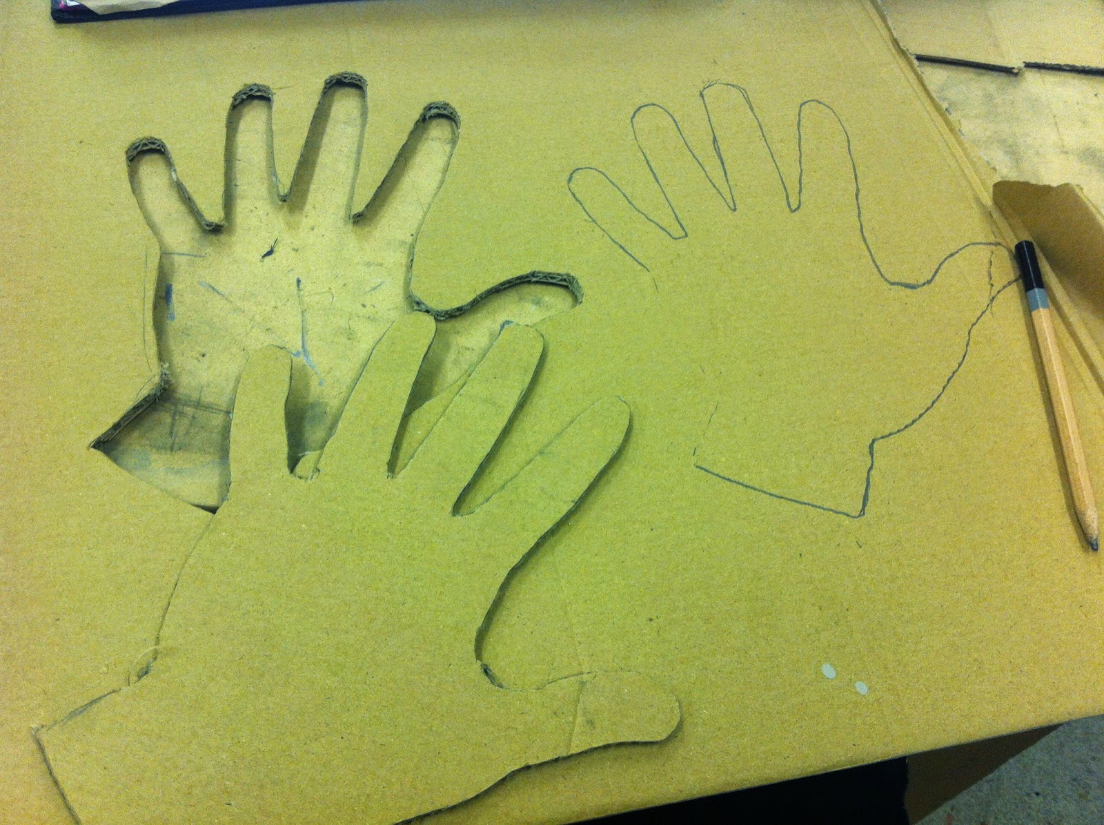
 I used different materials to create the sculpture. Experimenting and developing the statue in different styles. I used different materials such as cardboard and mud rock. I attempted to create my object in a 3d forum while using cardboard. It was quite difficult, but during the processes I watched what my classmates done to make their object in 3d forum, after observing I finally was able to create my statue to be able to see the whole object from all angles.  Creating my sculpture with mud rock was a lot easier, I used Vaseline and applied it onto my own hand to create a realistic shape of the figure. I wrapped mud rock around my hand to get the shape and figure of the hand perfectly. Which also saved time planning and trying to make the figure realistic and 3 dimensional.
 These are a few images I took of my designs of my sculpture using different materials. I also took a few images of what I was inspired by when I was drawing my designs of my figure from different angles. Looking at the sculpture from a perspective view point (as if I was looking at an actually sculpture from a worms eye view).


Tuesday 2 December 2014

Alexander Calder

Alexander Calder


Alexander Calder is am American sculptor. His sculptors were always distorted and verified different scales and shapes. Calder also created wire sculptures of portraits, figures and animals. In the wire sculptors you could figure out what the object was, but the figure would always be slightly distorted as it is hard to frame the exact shape of the subject using wire.

This is one of my favourite wire sculpture. The
Style of the sculpture interests me, as it seems to
Be half cubism with a few features of the face,
And also art Nuevo with the use of lines for the
Hair. Another thing that interests me about this
Sculpture, is the simplicity of the subject, but
Also how difficult it is to make and create the final outcome if it. The piece of art work displays a portrait of a woman with distorted facial features, showing an unperfected sculpture. I think what Calder was trying to show/explain thru his sculptures, is that not everything is as it seems; and not everything is perfect. So by changing the scale and figures of his sculptures, he was trying to change what people saw and to also change people’s views on perfect.

A few more of the artist’s work and sculptures....

Thursday 20 November 2014

the fourth plinth


The fourth plinth 


an empty fourth plinth

The fourth plinth is a plinth in Trafalgar square in central London.  The reason being of its presence, is because of an originally planned sculpture, that’s was placed on the plinth of William IV, king of Great Britain and Ireland. But because of insufficient funds, the plinth had to remain bare. It stayed empty for almost 150 years, till 1999 where it was announced that three contemporary artworks were to be displayed onto the plinth. After a while, artists from worldwide started to create different sculptures to be displayed onto the plinth. This would get the artists know, as the sculptor will be seen by a huge number of tourists, the London public and admires of art who might want to buy the sculpture.


The next two artist that are going to be on the plinth, is hans Haacke and DavidShrigley. The two winning Marquette’s are currently being placed on exhibition at the royal London hospital in Whitechapel.

Two new commissions 
Hans Haacke dsign for the plinth portrays a skeleton view of a riderless horse. It’s an ironic sculpture as it’s intended on the equestrian statue of William IV originally planned for the plinth. At the front leg of the hours sculpture is an electorinic ribbon, displaying a live feed ticker of the London’s stock exchange, making the complete link between money, power and history. 

David Shrigley’s statue is a ten-metre-high hand giving a thumbs up. He has used the same colour as the other previous statues in Trafalgar square, dark patina. The height of the thumb on the statue has been exaggerated; The reason being is because Shrigley ambition is to make simple gestures to become a self-fulfilling foresight, that things that are considered bad, for example money problems, unemployment, the weather and society, will benefit from a change of agreement towards positivity

Tuesday 11 November 2014

Man ray, painter, photographer and film maker
Man ray was mainly known for his photography work which crosses between two different art movements ‘dada and surrealism’.  He experimented with photography, seeing different ways to produce the picture. Around 1921 Ray also rediscovered how to make ‘camera-less’ pictures, which he called rayographs. He also experimented with cubist style of painting, and later moved to a different style; abstraction.
Ray was inspired by an artist called Stieglitz, who also worked with photography. Stieglitz used a similar style to Man ray, snapping images that provided a factual look at the subject. Ray also found inspiration at the armory show of 1913. The show featured the works of arts such as Picasso, Wassily Kandinsky and Marcel Duchamp.
   This is one of my favourite Mvan Ray photographs. The photography doesn’t contain much detail of what is included in object, nor the outline of the object and the negative and positive space. That’s why I prefer this photography, as it’s something different and new. Most photography’s always contain the details and show every colour on the subject, but Man ray develops his picture in a different, way which interests the viewer. The effect of the negativity in the photo, shows the object going from light to dark. This is because where certain areas of the object in the picture are placed, for example if some parts have been placed under another then the area is dark, but if there above, the object is lighter. He used a machine called an enlarger, it’s what gives the negative effects of the picture.                                                                  


ENLARGER


https://www.youtube.com/watch?v=KIr9NXrp1ro
The link is a video about Man rays portrait of lee miller, a woman whom Man worked with, and also loved dearly. The video explains how Man ray created a new style/effect on his portrait of lee miller, and also his relationship with lee miller.


Looking at Man rays work, I started to work in his style and create a few examples of my developed negative.  The outcome was better than I expected
My own outcome in the style of the artist

Thursday 30 October 2014

Evaluation


Evaluation

I fully understood what my project insisted of, and what my aim was for the assignment. My first thoughts on receiving the assignment brief, was that it would be something new for me as I am working on a bigger scale. My second thoughts were if I would finish the design in time, as there would be other work to be done during the process of the assignment I collected the majority of my research from the internet, for most of the artists within my sketch book along with my blog; another source that I used to collect a bit of my research from, was a few PowerPoints of different artists shown by the teachers during the beginning of the class. There were a few difficulties during my artist’s research, as I could not find out a few details about the artists. For example what career they pursued before becoming an artist, what inspired them for a few of their outcomes and designs. 
I was satisfied with my design because the outcome was better than intended, and each panel of my box shows I cared about the detail, and I wanted to complete each section to a high standard. The few things I could have done differently or improve on, is the blending of the tones and shades for my self-portrait side of the panel. If I had developed this skill more, and practiced blending different colours to create different shades, the outcome of my design would have been better greater. I didn’t organise my work to a great extent, as I spent most of my time designing my panels for the box, rather than showing what different options I could have used for each side; or step by step designs which lead to my final choice for the design of the box. Eventually, I did get to a point of at least showing some forum of planning. For each panel on my box, I drew 2 different options of designs I could have chosen from to place onto my box; for example, I choose two different sections from my zentagle designs that I laid out into a plan for one side of the panel.
The few things I learnt from this project is ne styles of line drawing, along with a few new artists and their style of drawing, painting or any forum of art that they create. A few of the artists, I could use later on during the process of the course, as inspirations for different projects and assignments. Although, I did not gain much knowledge, other than a few new styles of drawing, or more artists that I can add to my library of information of the art world; but the whole processes of the assignment did give me confidence with working on bigger scales as it is not something I find ease at. I didn’t complete all assigned work in time, but I managed to complete a few or at least start some in my sketchbook to show signs of work rather than an empty book, or pages that aren’t stuck in as that will decrees marks for my presentation, and lack of work. There was a few works that were rushed, weren’t the best option as sometimes it’s more about the quality of your work rather than the quantity
The most unsuccessful aspect of the project was not completing the whole design of my box. Even though I did start all panels, am still not pleased with myself for not completing the aim of the project. Although, the best aspect of the project was being able to present my art in a new way, and also learning new forms of art styles than I can use later on. I don’t believe the standard work in this assignment is better than my last, as my last assignment was something I specialized in, as it’s involved with illustrations. And I find am much better at what I do and love, so therefor show much better standard work.  


Thursday 23 October 2014

Michael Craig-martin


From there, he started to


    Michael Craig-martin


Basic info:
  •        Craig-martin was born in Dublin Ireland in 1941
  •      Grew up and was also educated in the United States, studying   fine art at the Yale university school of art.
  •     Irish sculptor and painter


Michael Craig-Martin ‘An Oak Tree’, 1973
© Michael Craig-Martin
an oak tree
Craig-martin first early work was inspired by American artists that he mostly admired, such as Donald Judd (an architecture) jasper Johns(painter) and Robert Morris (felt sculpture). So looking at all these artists, Craig-martin combined the different styles together, to make his own new sense of design. Working in various forms, always maintaining a stylish, refined abstract paintings and sculptors. Although most of his work mainly insisted of ordinary household items, Craig-martin still would change the complex of the object to a different sizes and contrast. I try to use colours in their purest form. My fundamental palette is very intense, with each colour brought to its highest level of intensityA quote from (http://www.theguardian.com/artanddesign/2009/sep/20/painting-michael-craig-martin) explaining what Michael Craig-martin thought of his paintings and the reasons for the colour scheme used.

Craig-martin firstly started his career teaching in England around 1973 at Goldsmiths College, where there he remained a powerful influence on the students. while teaching, he started to produce a few sculptors. for example 'an oak tree' the sculpture consists of an ordinary glass of water placed on a small glass shelf, the type normally found in a bathroom. An early stage of his work which links to the more complex style Michael Craig-martin uses now. 

Thursday 25 September 2014

Matthew Hollings


Matthew Hollings is an illustrator currently living and working in Manchester. Clients include Guardian newspapers, Sunday Times, Sony, GQ magazine, Toyota, Dennis Publishing.

Matthews’s Tumblr: http://matthew-hollings.tumblr.com/ . This includes a few of his inspirations to create a few of his illustrations and designs. The site also includes recent works.


Rizzle Kicks for regular spot in Q magazine
Rizzle Kicks for regular spot in Q magazine
This is one of Mathew’s design that I favour.
 Reason being is because of the simplicity of the
Work and the use of different lengths and sizes
Of lines. He also added a few tones to the
Portrait. There not done to an excellent 
manner,
But you can see the light and dark area 
depending on the direction of the light.


An overview of artist:
A contemporary illustrator working in journalistic and publishing markets.
Matthew Hollings work bridges the divide between traditional draftsmanship and contemporary digital mark-making. Images initially start out as hand drawings before being scanned into the computer to be coloured and composed. Influences are drawn from a range of subjects, often found in the content of his work. Matthew is equally as comfortable addressing mark-making challenges of portraiture to conceptual demands of narrative.Matthew is a graduate of Camberwell College of Arts and currently lives and works in Manchester, UK.


there imagines are designs of matthew for companies and products such as tesco. He created a few ad designs and posters that were interesting to me. For example the one below of the social media and social apps.

Fresh from the Bank Holiday weekend, this is a new illustration I’ve done for BBC Focus magazine, accompanying an article about the future of robots and the likelihood of them being far more mundane machines than those often portrayed in film. I’ve been producing a number of editorial illustrations for the Grocer magazine recently and have thoroughly enjoyed doing so. The content of the images tend to be weighty enough to really get my teeth into and the scale large enough to sufficiently get lost in detail! Art Direction: Stuart Milligan.This is the latest illustration I have produced for BBC Focus magazine, to accompany an article about the future of the gaming industry. Though obvious improvements to game-playing would be in graphics and sound, the article explained how games could become emotionally intelligent, reacting and responding to individuals according to information submitted to social media sites. For the illustration, we decided to simply show the game-player sat amongst standard and personalised app icons that were being blasted from the screen, the result of which I am pretty pleased with.  Art Direction: Sam Freeman

Thursday 26 June 2014

life in the homeless lane


Dear readers
 
Lately, I’ve been coming up with an idea for my final poster for the DE PAUL CHARITY. I took a few pictures of one of my classmates for my final design.  The final design will include a removable homeless person; Showing that you can help them from such situations by giving a helping hand.  I was inspired from looking at posters of charities from the web. Seeing the few designs and how a majority of them showed the homeless person on the streets, I thought why not also do that but make it more interesting and interact with the viewers. And that’s how I came up with the idea to make the homeless person able to peel off the poster.

left lonely


 sleeping out on the streets


I wanted the pictures to look more realistic, as if the person was actually homeless so that it gave a more real experience on how the person would have felt, their facial expressions; Giving off a mood of despair and in need of guidance and help.

Monday 12 May 2014

Work Processes


Dear readers. For the past four weeks I’ve been creating a response to my artist, using inspirational images based upon a positive atmosphere towards my assessment of the de Paul charity. Which is to help the less advantaged. I also took a few images of my own to use for my inspirations and designs.
HELPING HAND

This work is developed in the style of Michael Craig martin. Using imagery of my own. The picture i used represents "a helping hand" which links to the mission statement of the charity, as we are lending a helping hand. Helping the less advantaged. So i showed two hands reaching out as if in distresses.


The other design is showing offering of a flower (rose). It symbolizes positive through the flower being given to someone .The flower itself could be used to represent different types of messages; it could represent love and peace through one movement. The picture also bring happiness to people who are offered the flower which links in to my mission statement of the de Paul charity (offering help, providing peace and happiness)                                                                                   

OFFERING OF FLOWER
artists work
                                                                                               

The finally design is a simple flower. As I’ve said before it symbolizes love, peace and sometimes hope. The reason being why i choose a simple image succh as a flower, was so that the viewers could simply understand what message i was trying to provide, after they had seen all my other designs.


Tuesday 4 March 2014

hello readers, I have been set a brief by the publicise of the organisation 'DE PAUL CHARITY'. It is a charity that helps youths who are homeless, vulnerable and also disadvantaged.  The publicise asked me and a few other students, to create an advertisement to display their work and company; Using our creative art skills. They have asked us to include within the assignment, to communicate a powerful imagery or text to catch the viewers attention to want them to help out with the charity. so with that in mind I started to explore the symbols behind colours included within the rainbow, looking at different re-pretensions from different parts of country's looking at views of what they think the colour could  represent. after looking at colours i started to make little colour swatches using a word. for example 'joy' I then had to find colours that could represent joy and also collage in pictures also. I also looked at messages within  different advertisements, looking at the company and its products and what is the main attention based on within the ad . so looking at what catches your attention.
overall, what i intend to do with the ad. is to make it remediable to those who see it; making it show the positives of what the charity has done for those young people, but also showing a few negatives based on the viewers helping with charity. im looking at the artisit called J Howard Miller. the reason being, is beacuse of his work. which i got my inspriation from. influenced lots of people because of how it advertised and presented itself to the viewer, using a simple but yet beautiful style. I wanted my ad to have that kind of affect to others, leaving a big impact that changes them. his work is based on advertisment, mainly towards women. impowering them to join the army or do more that just house work. one of hos famous poster design was 'we can do it'; which was telling women to join the army, helping out the solders with medical care and to also be able to buld weapons.