Friday 26 June 2015

Printing Evaluation
In our new project, we were asked to create a sequence of different techniques of screen printing. In the first week of the project, I was showed how to create the printing style called sponge print. The process of making this print style, included two A4 sheets of plain paper, which I created motifs out of, by ripping the paper, and placing it onto the A4 paper, applying acrylic paint using the sponge, to make an imprint of the motif.
After applying the sponge onto the acrylic paint of choice, creating any colour scheme or pattern. What I liked about the style, was how simple and creative it was. Being able to create an artwork, simply and effectively is harder, but to be able to create something that is both simple and artistic, is quite interesting. As loads of people find it hard to create an artwork, as they have the belief that they can’t draw, it makes it extremely difficult for them to construct a creative artwork, especially prints. I was very pleased with all my outcomes, as to each outcome was quite interesting and unique from the others.
On the second week, I created mono prints created by using different inks, on plain paper sheets, and using paper to create the motifs for the print designs, kind of similar to sponge printing, but using different media. It was not difficult to create this printing style. It was not very difficult to create this printmaking style. The only difficulties I had during the process of the printmaking was taking paper from the ink and also creating the shapes I wanted within the paper. Overall this was not one of my best outcomes, and printmaking styles, but some of my outcomes were quite different, so they were quite interesting to look at because of the design.
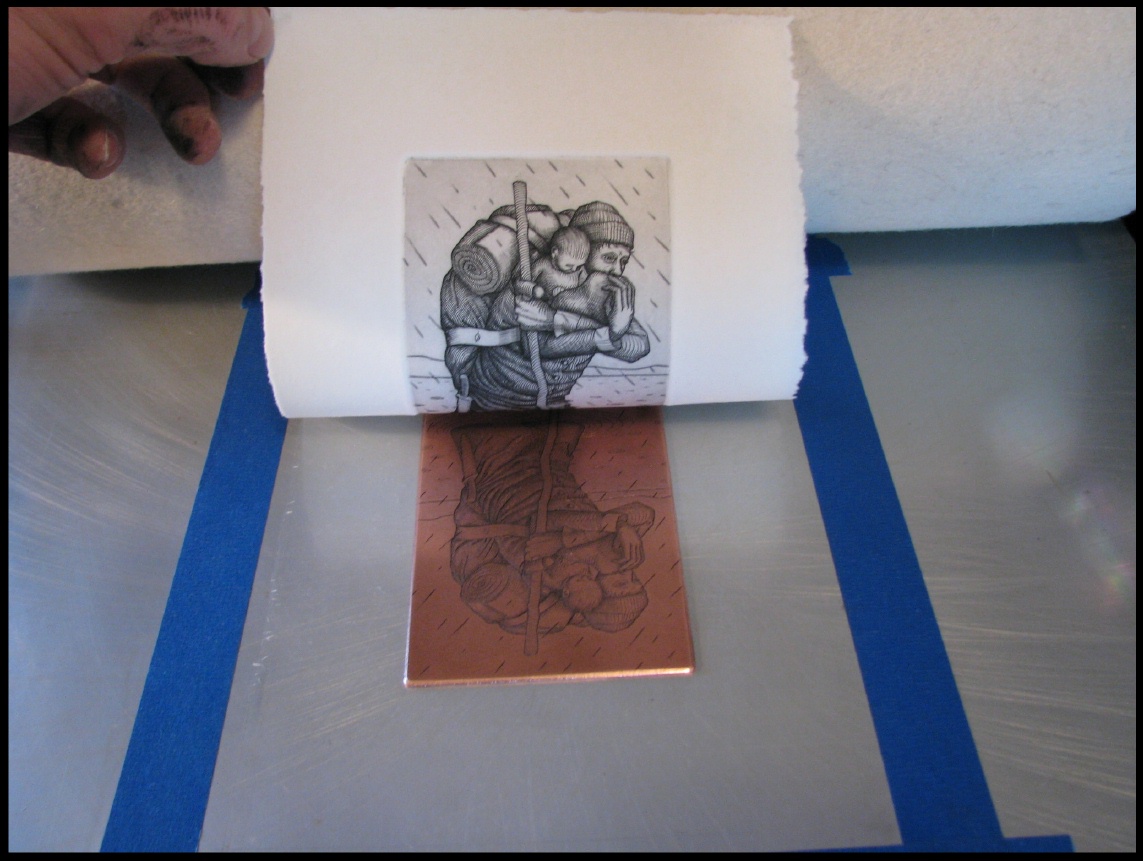
Moreover, I constructed a lino print, of a bomb with the Logo of the bank of china imprinted on it. The way in which the print was created, was to produce a surface relief printing medium, using the cutting blades of lino to carve my design into the lino. Afterwards, I applied printing ink onto the lino, by putting a small amount, of paint on a transparent pallet, using roller to roll the paint thin and applying it onto the lino. A paper was placed onto the inked surface, rubbing the back gently, to make an imprint of the design.
I was able to generate a variety of outcomes of the lino print design, by changing the colours within the prints, by printing onto coloured and plain papers, as well as newspapers and fabric. This enabled me to create different textures of the prints that I mounted onto A1 paper.
I was very pleased with these outcomes as they came out to a great standard, even though I made a couple mistakes. I still made use of these mistakes and included them within my design to show my improvements throughout my prints. One of the outcomes that I enjoyed was my two final prints working in stencils. It was inspired by the Bauhaus movement and the logo of bank of china which was the requirement of the whole project, to create a final print that could be used by the bank of china for their new logo design and it had to include inspiration from the Bauhaus movement.
My final prints were constructed using printing technique called stencil. I very much enjoyed this technique as it was quite simple for me to construct an outcome using this technique and it made it easy to create my outcomes as it was not complicated to draw out the design. Although there was one complication of the technique, as I had to be careful on what I choose to cut out, as making one small cut would lead to the design falling apart or not make sense when printed.
In my opinion, I believe my prints were successful because, they reached the aim of the assignment brief, by creating an outcome that showed a clear link, to both the Bauhaus movement and bank of china. If I was to given the chance to do this project again, I would incorporate more details within my print design
Drawing project evaluation
When given my project brief, I fully understood what the aim and the outcome of the project insisted of; a variety of different drawings displaying different medias and drawing styles, and to have a finally outcome that shows at least one of these drawings techniques and media. Upon receiving the assignment brief, I was feeling worried and anxious about how the project would go as I found drawing a long process for me, as I always take my time with every drawing and therefore being behind on work and eventually my work load build up; so I was not excited about this project. During the project not much research was needed for this project.
All that was required was to create to have a visual diary that included a variety of different observational drawings that we drew outside of the class. I didn’t experience any difficulties with my visual diary as the work included within my sketch book was of my own choice and could be rushed or precise if wanted to. This gave me relief and hope as I could do any drawing I wanted within my own time, therefore at least having a few completed drawings to add onto my project. I had to fill out my visual diary to help build my drawing skills as the weeks went on. Looking back at my visual diary I see a lot of progression throughout my book. This also helped me with my final piece as it was allowed me to generate ideas and record how my ideas developed.
I was not satisfied with almost all of my outcomes as the majority of my outcomes were not finished as I was using up too much time on one drawing. Also some of the outcomes were not done to a great standard and looked rushed. If I had spent more time and focused on my outcomes and become more pleased with the drawings
I choose my final drawing by looking at a few examples of drawings from Pinterest and was inspired when I came across a drawing where the model who had been drawn had been spilt into sections where one part was a close up of a part of the face. So I did something similar, but however I didn’t zoom into a section of my model; I used two images that expressed two different emotions. One shows my model in an upset/depressed manner while the other is of her gazing and wondering. The reason why I choose these two emotions was because they make up the models persona. I decided to draw the sad and depressed versions of the model as it’s what’s hardly expressed by her as she hides this emotion, so I projected it bigger, while the gazing emotion I made smaller.
The background aspect of this final outcome was to show and express someone close to me and send out a message to them that they don’t hear often about themselves. Almost as if I was trying to show the model her own persona from a different angle.  I also choose to make one of the emotions meaningful towards herself. For example making the gazing emotion smaller and gazing at herself was about her confusion for her goals in life. What she wants and aims to be.
I mainly only used colouring pencils for my final piece. Using only colour’s that expressed the emotion and then colours that went well together, but I also used pencil for a small section of the drawing. I also used different Medias for my other outcomes. For example charcoal and biro pen along with the common hb pencils. None of those equipment’s were of new use to me as I’ve had experience in using them to draw other outcomes in previous works along with in my own free time to practice.
In some of my outcomes I did experience difficulties. For example within one of the drawings our aim was to work without looking directly at our object. So therefore I had to walk to the objects, remember what I saw, and then walk back to my drawing and add it on. Therefore relaying on memory rather than sight. So I experienced difficulties with getting the correct angle and perspective.

Overall I did not enjoy the assignment, as majority of my outcomes I did not finish nor was I pleased with them; although I was pleased with my outcome as although it was rushed, I still liked the outcome as it came out better than I hoped and expressed what I wanted to project.

Thursday 25 June 2015

Chair project evaluation

For this project I was asked to create a model chair design influenced by the style of art deco and art nouveau. At the beginning of the project I struggled to understand the assignment brief as I wasn’t sure on if we had to create a life size chair or a prototype; but eventually I did get to understand the assignment more, and eventually started to like it. Exploring something that was out of my imagination of doing. Although while perusing through the process of creating my designs I had a few struggles and complications. The main issue was with drawing my chair designs in different perspectives such as isometric and orthographic wasn’t the easiest drawing style. Trying to draw the chairs from different angles so the viewer can get a clear understanding of my design; but I did get the hang of drawing within a different viewpoint.
I used the internet as my source for the information required as everything I needed was easily found through typing in the information I was looking for. Although I did look through a few chair books to get some sort of inspiration for my next designs. While using my source I did manage to get a lot of background information about chairs from a variety of different centuries and there improvements along with background information on art deco and art nouveau. While researching I took inspiration from the creative chairs made throughout the decades and started to do sketches from the designs and took little aspects from each individual chair I had looked at.
Making my final outcome was easier than I thought as I made it up as I created the chair, but I did get inspired by one of my chair designs but improved on the chair, only taking the shape of the seat from my original drawing of a design idea for a chair outcome. The outcome of the chair was great and better than I thought. I added aspects to the chair to try make it individual to the others within the class. For example making my chair have movement (spinning) so that whomever sits on the chair can have enjoyment rather than just comfort. I don’t feel as I could have improved upon the chair outcome as the final design was better than I had hoped for even though I had not finished the design fully. I used macette to create the chair along with nail and tissue paper. I used a nail to make the chair spin around and the tissue paper to cover majority of the chair to make the chair look as if it was made of more than one material. While creating the chair I did have trouble in making the chair spin. I did not know how to join both the stand and seat of the chair together for it to be moveable, but eventually getting help from a fellow student, I was able to find a way to join the two and still be able to get the chair to me.
Looking through my book, I feel as if I showed a clear idea of designs for my chair aswell as the required information I needed to include from the art form of art deco and art nouveau. I did show a story throgught my book of my chair ideas until it came to making the chair as the final outcomes was an improvisation of a small section of my art deco chair idea. As when I started to make my chair, I did not include any information to what had lead me to create my final outcome, only ideas.

During the processes of the whole project, I feel like I’ve gained and learned new aspects for myself to use in future life. For example the processes of creating a house hold item/ object and also how to create a miniature chair. Overall I did enjoy the project as it was an ease to do, even though in the beginning I was confused. 

Unit 77 evaluation

Unit 77 evaluation

 For this project my assignment was to create a bunch of art work inspired by a variety of different artists and the art style of Bauhaus and geometric shapes, while working in different styles inspired by a verity of artists. When looking at the brief, I found the assignment quite simple as the outcome was to create a bunch of different outcomes that were both inspired by Bauhaus and arts and craft movement. Although I did have a few difficulties in coming up with outcomes and designs inspired by some arts for example wassily Kandinsky. Although his work was quite simple to create, however I could not find an inspiration for my own outcome and final piece working in his style. The majority of my research came internet as I found it easier to look for the required information I needed to write about my artist. Although I did go on a visit to the Whitechapel gallery to see the works of Malevich and his black and white squares along with other artists included within the gallery. While researching background information about Josef albers and his coloured squares, while looking at his paintings, I became inspired to create some of my outcomes from looking at a few other painting of his. I later went back to improve and create more coloured square outcomes as I still inspired to create a bunch of non-simplistic outcomes near to the end of the project as more art work inspired me. My final outcomes inspired by Kandinsky was inspired where chosen by a variety of different things; for example two scenery’s along with an object and a song for one of the finals and also some of the qualities and details included within some art work of the artists paintings, to make a clear link towards mine and that of the artist. I had struggled in making the two final paintings as working with acrylic paint was not easy for me as I could not contain it or control it once it had been placed onto the painting, so I had a few issues in getting the paint and outcome too look how I wanted. Although some great outcomes came from the mistakes I had made with the painting therefor I was still pleased with the outcomes. Although I could have improved upon my skills to make the painting look much better and also not rushed. Throughout the processes of this assignment I did learn new art movements that I could eventually use within our works and projects. Coming to the end of the project I didn’t get to complete all my work as some pieces of information and writing was not included within my book as I had to try get what I had done already into my book, but overall I still had the most important and useful outcomes and information required in my book. Looking back at the project there is a few improvements I could have made towards the entire project as some of the outcomes were not to a high standard as expected and required; but some things were to great standard for example the outcomes inspired by Josef albers as I made great outcomes.

Friday 12 June 2015

Wassily Kandinsky


Wassily Kandinsky
Wassily Kandinsky, one of the inventers of modern and abstract art, exploited the strong images, memories and feelings between colour and form to create an artistic experience that engaged the sight, sound, and emotions of the public. He believed that abstraction was the possibility for thoughtful, inspiring expressions and that copying from nature restricted with the process, so he went against it, creating diverse and deformed art inspired by different aspects of things. He was highly inspired to create art that communicated a universal sense of spirituality, modernising a pictorial language that only loosely related to the outside world, but expressed volumes about the artist’s inner experience. His visual vocabulary developed through three stages, starting from his early, representative canvases and their divine symbolism to his energetic operatic compositions, to his late geometric biomorphic flat planes of colour. Kandinsky’s ideas and art work inspired many generations of different artists, from his students at the Bauhaus to the abstract expressionists after World War 2.


composition VII


Commonly known as the highpoint of Kandinsky’s pre- WW1 achievement. This composition of ‘VII’ shows Kandinsky’s rejection of graphic, symbolic representations through a swirling hurricane of colours and shapes. The operatic and loud mixing of forms around the canvas demonstrates Kandinsky’s belief in that painting could induce sounds the way music was in-titled to mind certain colours and forms; even the title of the composition aligned with his interest in the twists and twins of the musical with the visual and highlighted Kandinsky’s non-presentational focus in this work.
As the different colours and symbols spiral around each other, Kandinsky eliminated traditional references to depth and placed the simple different abstracted glyphs in order to communicate deeper themes and emotions common to all cultures and viewers. Anxious by the theme of disaster and improvement throughout the 1910’s, Kandinsky formally tied the whirling composition of the painting to the theme of the cyclical processes of destruction and salvation. Despite the seemingly non-objective nature of the work, Kandinsky maintained several symbolic references in this painting. Among the various forms that built Kandinsky’s visual vocabulary, he painted glyphs of boats with oars, mountains and figures. However, he did not intend for the viewers to read these symbols literally and instead imbued his paintings with multiple references to the last judgment, the deluge, and the Garden of Eden, seemingly all at once.


Painting was, above all; deeply spiritual for Kandinsky.  He wanted to carry out deep spirituality and the depth of human emotion through a universal visual language of abstract forms and colours that transcended cultural and physical boundaries. Kandinsky viewed non-objective, abstract art as the ideal visual mode to express the “inner necessity” of the artist and to convey universal human emotions and ideas. He viewed himself as a fortune-teller whose mission was to share this ideal with the world for the betterment of society. He viewed music as the most transcendent form of non-objective art - musicians could evoke images in listeners’ minds simply with sounds. He strove to produce similarly object-free, spiritually rich painting that referred to sounds and emotions through a unity of sensation. 

Wednesday 29 April 2015

ART DECO


Art deco is a global inspiration art form with a wide-ranging style that draws on many sources; it was the firstly embraced design movement by artists and artisans (artistic craftsmen that work alone or in small groups and make furniture, clothes or even food creatively) across the world. The term ‘art deco’ originated from Paris from the 1925 art exposition at le muse des arts decoratifs. The exposition was meant to be a display of nouveau designs from around the world, but U.S. Secretary of commerce Herbert Hoover declared Americans off limits from entering, as he felt no contemporary architecture was “new” enough. The 1925 french art exposition “international des Arts decoratifs” served as the element for designers mixing exotic glamour with clean, masculine lines. It is captivated by much of the style of the roaring twenties and the great depression era. During the styles uprising, it was referred to as ‘Style Moderne’ and ‘Art Moderne’ by strict critics such as Jazz Modern. The term ‘jazz’ was an insulting term in traditional circles.


Bevis Hillier
Art deco was not published until 1968, were British art historian Bevis Hiller published ‘art deco of the 20’s and 30s’ that the name finally stuck; but due to the fashion era of the twenties evolving into a more modernised design in the thirties, some designers continued to have their doubts about identifying a collection that could be accurately labelled Art Deco. Although in 2003, a large exhibition on Art Deco was hosted by Victoria & Albert museum, finally confirming its acceptance as a genuine and distinct style of its time. Designers continue to pay a tribute to the art forum of Art Deco today, through architecture, furniture, furnishings, objects, art, fashion and jewellery. Reinterpreting the movement for the 21st century. The London Art Deco society celebrates this by featuring Art deco new waves venues. 


One of the inspired artists that interests me from this art form is Tamara de lempicka. Her work was of portraits of writers, entertainers, artists, scientists and industrialists; it consisted mainly of rich and successful people. No one from underclass, since In her childhood she was spoilt by the age of 14 by her grandmother with clothes and travel, after her parents were divorced. This is what bought her, her critical acclaim, social celebrity and considerable wealth.  After her second husband death she went on to live near her daughter to start painting with different materials such as a palette knife, much in vogue at the time.

Wednesday 15 April 2015

HISTORY OF PRINTMAKING


Printmaking- is the process making of making a variety of artwork by using the method of printing, normally on paper, but also sometimes on such materials and objects as wood, lino and metal depending on the printing style. Printmaking normally covers the quality and originality of creating the prints, rather than just having a photographic reproduction of a painting.


105 AD – is cited as the year in which papermaking was invented in china.
Woodcut print

1380- Woodcut Printmaking, a relief printing plate made by carving marks in blocks of long grained planks or plywood. Long-grain refers to the grain following the direction of growth. For example, parallel to the tree trunk/ branch the piece of wood was cut from.


engraved print
1420-30- Printed Engraving is a method where metal plates begin to replace the use of carved wooden printing blocks for the reproduction of works of art. A plate of soft metal is used, most often copper, and the design engraved (cut into) into the surface using a tool called a “burin” which is a square tool-steel rod, sharpened diagonally at one end so that the prominent corner becomes an effective controllable cutting edge.


LetterPress print

1440-50- Letterpress Printmaking is a technique of relief printing using a printing press. A worker composes and locks movable type into the bed of the press, inks it, and presses paper against it to transfer the ink from the type. Which creates an impression on the paper. 


Etching print


1513- Etching is a traditional process of using strong acid or mordant to cut into the unprotected parts of a metal surface to create a design in intaglio (relief) in the metal. 

lithography print


1796-8 – Lithography originally based on the immiscibility of oil and water. Printing is from a stone (lithographic limestone) or metal plate with a smooth surface. 


Photogravure print
1852- Photogravure is intaglio printmaking or photo-mechanical process whereby a copper plate is coated with light- sensitive gelation tissue which had been exposed to a film positive, and then etched, resulting in a highly quality intaglio print that can reproduce the detail and continuous tones of a photography.

Saturday 11 April 2015

Black is like the silence of the body after death, the close of life." painted by Wassily Kandinsky in 1991


This painting to me gives off a sense of an indie type of music; the reason being is because of the colour scheme. indie artist album covers always included light colours such as cream, which in the painting is the background colour. and other colours such a blue, yellow and green. each colour is a light shade, making them suttle; something that is sometimes used within indie music videos and album covers. looking at the painting, from my own judgement, I see a deformed guitar within the painting taking full shape of a normal guitar as if its in the process of being made; this also links into indie music because they also involve guitars in their acoustics set. Paul uses a variety of colours, but used a sort of cream/green/blue background that blends together well making the different shapes within the painting stand out clear to the viewer but also complementing the background colour. something that is very hard to create, but beautifully done by the blending of different shades of colours within this portrait. Using light shades of the selected colours really made the painting more intriguing and interesting to look at because the colours make you feel happy rather than confused about the object trying to be represented. what makes this painting unique and different is how he does not try to portrays or make a clear visual of an object that you normally see within a variety of different artworks and paintings, but the work still looks like a master piece because Paul used colour to be his painting and used different shapes to add onto the beautiful mix of colours.


This pieces represents EDM (electric dance music) a broad range of percussive electronic music genres produced primarily for dance-based entertainment environment such as nightclubs, raves and festivals. the explosive artwork and colours represents the emotions felt when listening to such music as EDM. also with EDM music, the majority of songs include a base drop, which is represented through the painting with the light colours on the edges of the piece, showing tranquillity and the middle of the pictures shows the thrilling main body of the song for example at the start of where are u now, it articulates a sense of peacefulness whereas once it reaches the base drop, an explosion of sound and almost even colour is presented, just as in the painting. looking at the piece, visually all I see is a explosion/ chaotic scene. as if something bad has happened but then it turns into something beautiful. although there's no visible object I can see, I still manage to be able to see a scene and a story happening through the artwork itself.  The colours that Paul uses within this painting is what gives the painting its loud and dangerous, but fun effect on the viewer cause the colours are bright and very noticeable while the background is a settling colour that is not as bright, but more complementary to the explosive colours.


 judging from this piece of art work by Wassily Kandinsky; i get the sense of a jazz themed oil painting. for example the colours used within the painting represent the effects and emotions you would feel, when listening to the music genre; they expresses the sense and energy of jazz, expanding your mind and soothing your soul, as what jazz music does for people. Also another reason to why the oil painting represents jazz through my opinion,is because within the painting contains musical objects such as drums, piano and other instruements that are the basic intruments used when making such music as jazz, and the different symbols around the figures contained within the piece coyld be representing the different emotions and dances created by the mood and rhytm of the music created through jazz.


Thursday 26 March 2015

chair ideas

These are a few examples of my chair designs; trying to create a variety of different chairs while working with plain A4 paper sheets. A few of the designs were inspired by some of the mood Baard of variety of unique chairs already made and usable. What I did to make the designs of the chairs was watch a few tutorials from youtube. Which showed me examples of origami chair designs to create and also giving me the step by step guide on making the designs; but after the first outcome of the design I created, I decided to come up with my own unique designs as following the tutorials lead to me having the same outcomes as my classmates as they followed the same idea of watching tutorials on making the origami chair designs and landing on the same videos and tutorials as the rest of the class. This lead to a load of chair designs all looking the same, which was boring. A few of my designs were made by mistake/ improved from mistakes I made while trying to create a few original designs; so I changed around the mistakes to then be able to make a chair, improving the designs rather than starting again from scratch. I made a lot of mistakes because coming up with my own designs was a bit difficult, but the outcome of the designs were better than expected.
What I also like about my designs is how each individual outcome is very different and how each design has its own element that made the chairs  have its their own unique designs that interest different people. If I was to create the designs again, I would not change much about any of the designs. Although I would make more varieties of the designs, and also experiment around with the designs, trying to merge some of the designs together to make a completely different chair that has a mixture of qualities from two chairs.

In class we made a macette cardboard cut-out of a chair designed by the artist “Frank Genry”. We were all given the same pieces to cut out, so that everyone had a part in make the chair. Eventually after everyone had finished cutting out their individual pieces, we started to place the chair together. Once glued together, the chair started to form a miniature sized chair version of Franks originally designed chair, capable to be used on display but not to be used to sit on as it’s not strong enough to hold someone’s weight. The materials we used was a scalpel and cutting mat along with cardboard macette. A few others used scissors as it was easier for them to work with and use; but I preferred the scalpel as it was very effective and easy to use for me since I’ve had experience with the equipment enough to handle it. The outcome of creating the chair helped me have more experience with creating a chair design while using cardboard macette, so it was very useful towards my project as our aim is to create a chair. Although working with a cupboard maccette can be easy, but also hard to work with depending on what you are trying to make. For example, working with cupboard could make your outcome quite scruffier, shabby and untidy. Which is not always a great look on your work depending on if you wanted the design messy; but during the process of creating the model chair, since everyone was working on individual pieces that we were going to place together later on. The outcome of the chair was not all equally the same, as some parts were too short, too wide and not perfectly cut to how everyone else had theirs. So there was a huge difference in the effort put into the cut-outs to be neat so the outcome would look better. Overall the outcome was to standard as you could clearly see the chair forum as well as it being able to stand up without a problem. So overall the outcomes was as expected, but could have had improvements.

Thursday 26 February 2015

ART NOUVEAU


Art nouveau was firstly showed in Paris, and then later in London. The response of the public about the art style was a mixture of two responses, some loved the artwork because of its distinct looks. Such as curvy lines and harsh lines. While others loathed the style.
The style itself includes elongated, curvy lines that are more natural rather than the geometric, lines/shapes that the style art deco uses within the art work. Stylised flowers, leaves, roots, buds and seedpods. The female form in a pre-Raphaelite pose with long flowing hair along with the secondary having exotic woods, and silver and semi- precious stones.

The style was influenced by the arts and crafts movement. Art nouveau shared the same belief in quality goods and fine craftsmanship but was happy with mass production. Due to mass production, many art nouveau items are not valuable although still highly desirable. However, if the pieces is by a known designer, the price soars.
Art nouuveau style is based on organic colours and shapes. The style is mostly inspired by natural and nature itself. Using colours that come from nature and wild life. For example light shades of green and brown within the colour scheme.


VICTOR HORTA 

This work is of Victor Horta. An art nouveau architecture and designer. He designed the four major town houses ‘ hotel tassle, hotel van Eetvelder and maison located in brussels. He’s designs have lead other artists to be inspired within Europe because of his furniture designs and the art form.

What I like about his architecture designs is the way he uses the whiplash curves to forum around objects within his designs, and how they start to lead you around the architecture so you don’t only focus on certain sections and parts of the design, but your lead around it. Also, another intriguing interests for me is the colour schemer he uses as. Using a variety of different shades of certain colours that link within the art style of art nouveau. So using natural and nature colours, but he sometimes make a change so that the designs become more fascinating and attention-grabbing to the viewer or client.
 

Thursday 29 January 2015

BANKSY

Banksy is a British-based graffiti artist, political activist, film director and finally, a painter; although his identity has remained a mystery, even after over 20 years of being involved within the graffiti scene. He has become the most notorious street artists in the world because of his political and bold street art that always portrays a visual messages. His also developed an entire art subculture devoted to his works. He has worked with many different styles of street art media. His work not only includes many powerful, often controversial images, but they may also be found throughout the internet as viral images.
The most common form of street art that bansky uses, is stencils. These are often in the form of multi-layered stencils or combined with other media sources such as spray paint. He also combines anything found within the street, for example street signs, building rubble, or even already made graffiti typography to convey his message, making beautiful street art.  His work is often ironic and combines dark humour, to most likely not make his work just about the depression and statements created by today’s society, politics or beliefs.


Free Download HD Banksy Art Graffiti Wallpaper: Banksy Streetart Free Download Hd Banksy Art WallpaperAlthough we may know a lot about banksy amazing art work and style of working, very little is known about him, as he refuses to be interviewed and keeps his identity carefully maintained. The media and his fans have always questioned about his identity as there has been a lot of accusations due to a variety of identity claims. Banksy also seems to partly create an importance to understand his character by a few of his graffiti art work. Recently there was a theory included in an article newspaper publication, pointing out his identity of being a Bristol resident by the name Robin Gunninham. But what's more shocking about bansky identity is that he has managed to completely hide it from his family, till this date no banksy identity claim has ever been correct.

The images I’ve presented are a few of his artwork that I consider to be a big impact on society, and also stand out the most to me because of how Bansky has presented and laid out the image, the colours are dark but still intriguing because of how one colour makes the other stand out more, complementing each other. Looking at the images, they make me wonder about the message he is conveying through the artwork, trying to communicate with the public in a visual perspective that makes you look deeper than the artwork itself, trying to also work out the identity of the artist through his pieces.

Friday 23 January 2015

KAZIMIR MALEVICH


Kazimir Malevich painted ‘the black Suprematist Square’ in 1915, in the heat of World War 1. Although he did firstly consider and approach the idea 2 years before, in 1913. Originally the black square was not intended to have any symbolic meaning, its purpose was to solve artistic problems. However the painting encouraged a multitude of interpretations and even provoked sceptical remarks such as ‘so, this is also art?’ as anyone could paint a black square. In reality, ‘the black square’ is a very complex painting, creating and painting the square required a very  ssolid knowledge of colours, compositions and artistic proportions.
 I created the style by looking at a variety of different ways to arrange my squares. Displaying them in a variety of scales trying to make complex designs those similar to Malevichs style of working. After a while I wanted to change my concept and idea of making the designs complicated, so I changed them to simple but yet bold designs following Malevich creative style to show I was inspired and to be able to show my link towards his art work.


KAZIMIR MALEVICH


 What I like about his designs is how he makes some such simple designs, but yet they vary in composition and range of shades of the squares. Kazimir rarely used bright colours within his squares, the majority of his colour was scheme is dark colours, close to black. I believe he did this to make a bold statement within his designs, almost like a poetic piece of artwork that don’t clearly display its concept or statement, but gives you a chance to interpret the concept yourself, make you think of what the artist is really trying to make communicate.


JOSEF ALBERS STYLE OF WORKING


Josef Albers
    
Josef Albers is an American painter; born in the city of Germany, in Bottrop. He trained to become a teacher at Buren (a district of Paderborn in north Rhine_westphalia) in 1905-08, he taught for several years in a school. He believed that ‘teaching art is not a matter of imparting rules, styles, or techniques, but of leading students to a greater awareness of what they were seeing.’ He saw art work more as a visual of what others saw through their eyes, rather than what they were trying to explain thru the images. He cared more about the visual of the artwork.     
 Albers approach relied on direct observation and self-discovery. He absorbed in visual wonders, he would point out what others had perhaps viewed cursorily but not anticipated; the shape of the Yale football stadium, the spot of light that remains for a moment when a TV set is switched off, the way a red roof could merge with a blue sky etc. albers was, as his paintings and graphics reveal, deeply sensitive to the formal relationships of things, intensely conscious that everything in the visual field exists in context, and that every line and colour affects the next or adjoining line and colour.


While doing my inspired outcomes of Josef albers style, I thought more of how the colours blended together and the shades of colours he used on most of his art work, but a lot of his artwork involved bright bold colours so I mixed up and changed the shade of the colours so I could show I was inspired but wanted to make it a bit originally, so I mainly used darker shades of the colours that Josef also used to be able to link back to his work.
Some of my work is a very close match to his work, making it look like one his pieces, this is proving that I followed his style, but could have made more of an improvement to the outcomes to show more of a difference and originality. I could have done this by changing the scales of all the squares. Making bigger squares to show my own side of the artwork.

Monday 19 January 2015

visit to london


Recently I was up in London visiting the national art gallery and also taking pictures of the statue that is currently displayed on the fourth plinth. The whole reason for the visit was because of my project of producing a miniature scale model of my idea of a sculpture designed to be placed onto the plinth; seeing the statue up in person would help me to see how a statue would look from a worm’s eye view, which will also give me a better understanding of the perspective viewpoints.


After taking a few photos of the blue French cockerel which is the currently sculpture placed at the plinth, I went into the gallery to see the verity of art work and artists displayed in the gallery, looking at what artists inspired me mostly by their visual outcomes or their style of working and drawings to then make my own outcomes. I found two artist that caught my attention and I found interesting to study. 

One of the artists was Jacob Van oost. His artwork that caught my attention was “portrait of boy aged 11”  the reason why this portrait interests me is because of the brush strokes and the texture of the painting itself, how it looks so clean and smooth interreges my interest and it inspires me to want to create a similar type of painting. Looking at the portrait, the colours that Jacob uses are softer and natural tonal colours, using more brown and skin type skins colours with the background creating a focus point on the portrait of the boy. Also the texture of the portrait looks smooth and relaxed. Jacob did not try to rush the portrait, displayed by the detail of the clothes and also the feather like paint strokes on the fur.
His style of working is not similar to mine as his paintings are not scruffy but very detailed. The work is about where Jacob spent most of his life, therefore painting someone from his country. Judging from his outfit he was probably a member of one of the members of the merchart families in bruges.


Another of my inspired artists within the gallery was quirteem maslys with his work of “the virgin and child enthroned, with four angels” what I see is a painting symbolising the crowing of virgin marry in the kingdom of heaven with four angels by her side preparing her for the ceremony. It’s showing me a spiritual image that portrays an emotion through the image of harmony and spiritual connection to marry. 
Looking at the paintings, it shows a lot of detail of the fabric and clothing, it’s a very realistic paining of the architecture of the chair that marry sits upon and also the clothing’s worn by marry, probably trying to get the focus on marry. Although there is a lot of detail within the painting there is some aspects that aren’t very well painted realistically as the rest of the painting; for example the faces of the angels and marry aren’t really painted to a realistic style, but more just focused on drawing of a visible face to represent marry as he might not have been clear of how she looks so he didn’t want to show a clear drawing. The painting is displayed in the gallery to show a story thorugh the other paintings, showing the life of marry and Jesus Christ.